
Introduction
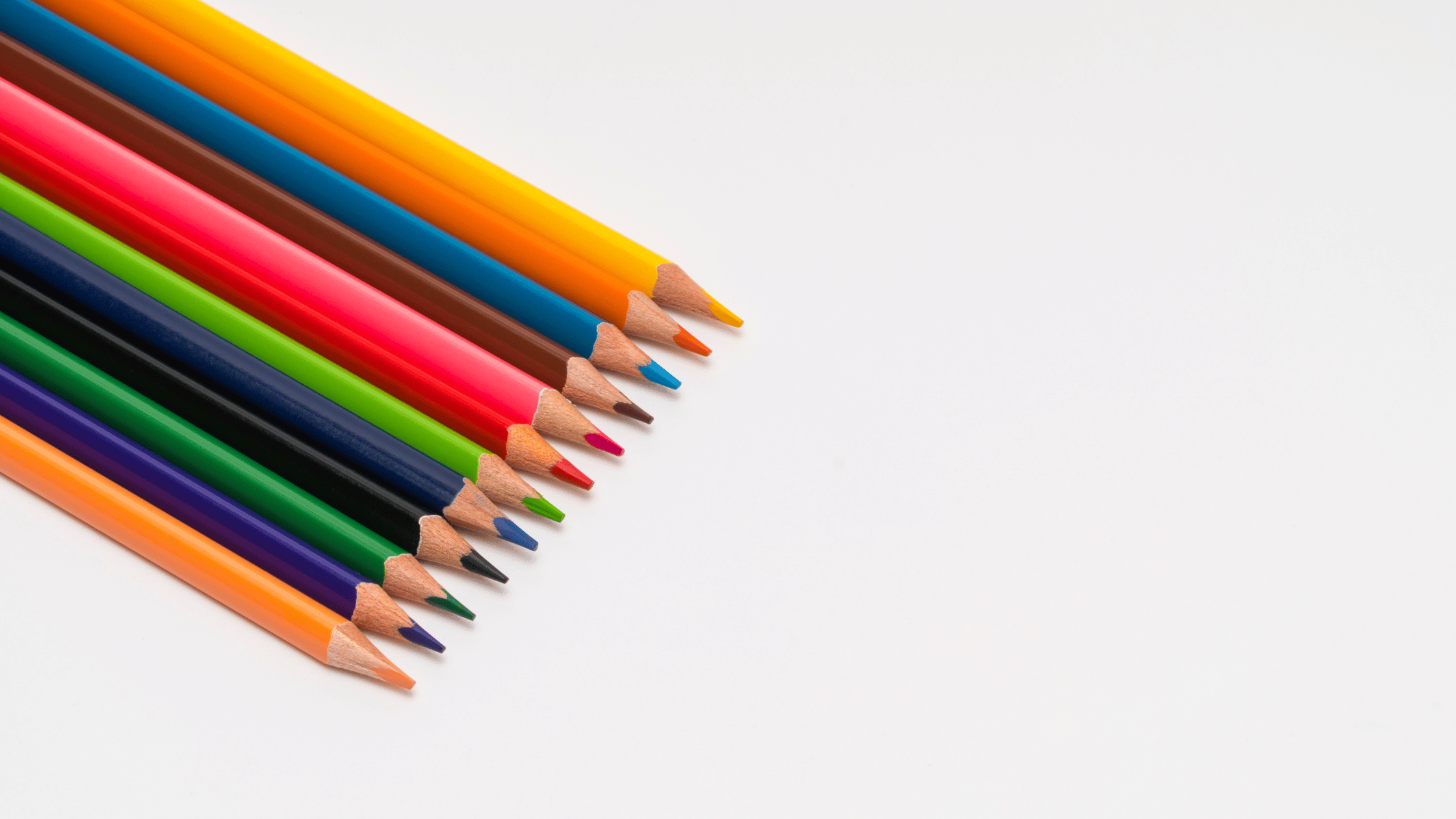
Color is everywhere—from the clothes we wear and the brands we trust to the moods we feel in a room. But color is more than just visual; it carries psychological and symbolic meaning that can subtly (or dramatically) influence our thoughts, behaviors, and emotions.
Whether you’re designing a logo, painting a room, planning an outfit, or curating a gallery, understanding the psychology of color allows you to communicate non-verbally with clarity and intent. Colors speak a language of their own, and learning what they “say” can help you guide perception, create emotional responses, and enhance impact—without saying a single word.
This article explores what different colors convey psychologically and symbolically, how they affect human behavior, and how you can use this knowledge in daily life and creative work.
The Basics of Color Psychology
Color psychology is the study of how colors affect human emotions and behavior. Though individual experiences, cultural differences, and context all play a role in color interpretation, certain colors have universal psychological associations.
It’s important to note that color meanings can be both emotional and symbolic. For example, red might trigger physical alertness (psychological) while also symbolizing love or danger (cultural/symbolic).
The reactions may be conscious or subconscious, but they are powerful—and often immediate.
Red: Energy, Passion, and Urgency
Red is arguably the most intense and emotionally charged color on the spectrum.
Psychological Effects:
- Increases heart rate and blood pressure
- Stimulates appetite and physical energy
- Creates a sense of urgency or alertness
Symbolic Meanings:
- Love, passion, desire
- Anger, danger, warning
- Power and courage (used in national flags and royal robes)
Common Uses:
- Sale signs and call-to-action buttons (to create urgency)
- Fast food restaurants (to stimulate appetite)
- Romantic branding (to evoke passion and excitement)
Tip: Use red sparingly in interiors or designs to highlight or energize specific areas without overwhelming.
Blue: Trust, Calm, and Reliability
Blue is one of the most universally liked colors and is often associated with calm and stability.
Psychological Effects:
- Slows heart rate and reduces stress
- Increases feelings of serenity and focus
- Encourages productivity in workspaces
Symbolic Meanings:
- Trust, loyalty, and professionalism
- Coldness or emotional distance
- Intelligence and technology
Common Uses:
- Corporate branding and banking (to signal trust and dependability)
- Social media platforms (Facebook, Twitter, LinkedIn)
- Hospitals or healthcare environments (to reduce anxiety)
Tip: Blue is ideal for professional settings, websites, and wellness-focused design.
Yellow: Optimism, Energy, and Caution
Yellow is the color of sunshine and happiness—but also of warning signs and high visibility.
Psychological Effects:
- Stimulates the nervous system and promotes alertness
- Boosts mood and mental clarity
- Can cause eye strain in large amounts
Symbolic Meanings:
- Happiness, joy, and warmth
- Youthfulness and spontaneity
- Caution, cowardice, or anxiety in excess
Common Uses:
- Child-oriented products or brands
- Warning signs and safety gear
- Creative studios and brainstorming areas
Tip: Use yellow in moderation as an accent to brighten and energize a space or design.
Green: Balance, Growth, and Freshness
Green strikes a perfect balance—literally and psychologically—between the stimulating qualities of warm colors and the calming effects of cool ones.
Psychological Effects:
- Eases anxiety and improves relaxation
- Promotes feelings of renewal and harmony
- Associated with health and environmental awareness
Symbolic Meanings:
- Nature, fertility, and growth
- Wealth and prosperity (money is green in many cultures)
- Envy or inexperience (“green with envy,” “greenhorn”)
Common Uses:
- Eco-friendly brands and wellness products
- Financial institutions and organic food packaging
- Interior spaces for calm and recovery
Tip: Green is excellent for health clinics, yoga studios, and outdoor branding.
Orange: Enthusiasm, Creativity, and Fun
A blend of red’s passion and yellow’s optimism, orange is lively, youthful, and attention-grabbing.
Psychological Effects:
- Encourages action and spontaneity
- Boosts creativity and social interaction
- Increases appetite and conversation
Symbolic Meanings:
- Adventure, innovation, and playfulness
- Value or affordability (often used in budget-focused brands)
- Warmth and sociability
Common Uses:
- Marketing for youthful or energetic products
- Seasonal promotions (e.g., fall and Halloween)
- Sports teams or fitness-related designs
Tip: Orange is best used in branding for active, fun, or casual brands—not luxury.
Purple: Luxury, Imagination, and Spirituality
Historically associated with royalty and wealth, purple is a color of both opulence and introspection.
Psychological Effects:
- Inspires creativity and imagination
- Conveys elegance and sophistication
- Can evoke mystery or spiritual reflection
Symbolic Meanings:
- Royalty, wealth, and nobility
- Magic, fantasy, and mystery
- Wisdom, dignity, or mourning (in some cultures)
Common Uses:
- Beauty products and luxury brands
- Meditation apps or spiritual spaces
- Art galleries and creative studios
Tip: Deep purples convey richness, while lighter shades (lavender) suggest calm and femininity.
Black: Power, Sophistication, and Mystery
Black is bold and complex—it can express authority or elegance, but also mourning or fear.
Psychological Effects:
- Evokes seriousness and depth
- Provides strong contrast and visual weight
- Can feel intimidating or closed-off
Symbolic Meanings:
- Authority, sophistication, and exclusivity
- Death, evil, or rebellion
- Simplicity and modernity
Common Uses:
- High-end fashion and luxury goods
- Technology and automotive branding
- Minimalist or edgy designs
Tip: Use black to ground your design or add contrast, but balance it with lighter tones to avoid gloominess.
White: Purity, Clarity, and Simplicity
White is the color of blank slates and fresh beginnings.
Psychological Effects:
- Enhances perception of space and cleanliness
- Promotes mental clarity and peace
- Can feel sterile or cold if overused
Symbolic Meanings:
- Purity, innocence, and simplicity
- Peace and cleanliness
- Emptiness or loneliness in excess
Common Uses:
- Healthcare and wellness branding
- Minimalist or modern design
- Bridal wear and ceremonial contexts
Tip: White is perfect for small spaces, clean layouts, and minimalist aesthetics.
Cultural and Contextual Differences in Color Perception
While many color associations are consistent, culture plays a significant role in interpretation.
- In Western cultures, white symbolizes purity, but in some Eastern cultures, it is linked to mourning.
- Red is seen as lucky and festive in China but signals warning or danger in Western contexts.
- Green may symbolize luck in Ireland but can have religious or political associations elsewhere.
Context matters. Always consider cultural and situational factors when using color to communicate meaning.
Conclusion
Colors speak volumes—even when we say nothing at all. Whether bold and commanding or soft and soothing, each hue carries a psychological charge and symbolic meaning that shapes how we think, feel, and act.
By understanding what different colors convey, you can make smarter, more intentional choices in art, branding, interior design, fashion, or even daily life. Use color not just to decorate, but to communicate—because in the language of visuals, color is your most powerful voice.